Réserver une Démo

Ce webinaire est terminé, l’enregistrement sera affiché sous peu.

Aperçu

Les graphiques d’Enterprise Architect peuvent vous aider à gérer les projets, à communiquer la stratégie, à identifier les tendances, à suivre les KPI et à prendre des décisions éclairées.

M. Scott Hebbard, responsable des communications chez Sparx Systems, démontre comment:

INSCRIVEZ-VOUS AUJOURD’HUI!

Ne manquez pas cette occasion d’en savoir plus sur Enterprise Architect

Session 1

Melbourne Fri 26 September 08:00 am
New York Thu 25 September 18:00 pm
Los Angeles Thu 25 September 15:00 pm
London Thu 25 September 23:00 pm
Auckland Fri 26 September 10:00 am

Session 2

Présentateurs

Ben ConstableSparx Systems

Explorez les ressources du webinaire

Exemple modéle: dashboard.eap Liens de Téléchargement

Questions et Réponses

Général

Graphiques et Tableaux de bord were introduced with Enterprise Architect 11.
To download a 30 Day Free Trial of the latest version of Enterprise Architect, please visit:

www.sparxsystems.com/try
It is part of Enterprise Architect at no additional cost. The Charts and Dashboard feature is included with all editions of Enterprise Architect.
Yes. Purchasing a license makes you a registered user for 12 months, which entitles you to download updates and new builds free for a period of 12 months.

Graphiques et Tableaux de bord

Enterprise Architect can create a number of different charts including:
  • Pie - 2D and 3D
  • Doughnut - 2D and 3D
  • Torus
  • Line Graph (Time Series)
  • Table (Model Views)
  • Horizontal bar - 2D and 3D
  • Vertical column - 2D and 3D
Yes. To generate a HTML report,right-click the package containing the chart you want to publish online and select the Documentation | HTML Report context menu option. This will allow you to automatically generate a web page that contains your completed Chart.

For more information, view this video on HTML Report Generation using Enterprise Architect.
On the New Diagram dialog, in the Select From panel click on Extended, and in the Diagram Types panel click on Dashboard. You will only be able to see Dashboard if you have Enterprise Architect version 11 or above.
If you want to use a chart on another type of diagram, select the Dashboard Toolbox shown in Figure 1.

Dashboard Toolbox
Figure 1: Selecting the Dashboard Toolbox to access Chart Elements.
The Enterprise Architect User Guide provides a comprehensive description of the Object Model. Review the object type descriptions and the table name for each type, under the following link (e.g. see Element Class to show t_Object).
The EAP file is available for download here.
Please enter the Model Credentials listed below.

UserID: admin
Password: password
Yes. Time Series Charts can be automatically updated by the Cloud Server according to a schedule that you define in the element Properties. The Time Series Chart element Properties can be set to record a result manually, daily, weekly or monthly.
Other chart images are dynamically generated, showing the selected properties of the model elements at the moment:
  • The definition is saved, or
  • The element's parent diagram is opened, or
  • You right-click on the element in the open diagram and select the Refresh Chart or the Refresh List menu option
Yes, Use Cases and other element types can be counted and included in Charts. For example, the video presentation shows a Chart in which all Classes in the model are counted, and that sum is then displayed via a chart.
Examples can be found under the Reporting | Charts section of the Enterprise Architect User Guide.
Also read the Enterprise Architect User Guide for more information on the Enterprise Architect Object Model.
Yes, you can create a dashboard based on the contents of a package and CSV data. Both techniques were shown during the webinar.

At the 2 minute and 30 seconds mark, the video shows how to generate a graph based on package contents. While at the 9 minutes and 30 seconds mark, the webinar demonstrates how to graph CSV data.
The Chart Data is contained within a Tagged Value labelled ChartProperties. An example Tagged Value is shown below in Figure 2. You can copy the text from the Tagged Value and use it to conduct further statistical analysis such as regression analysis in a third party tool. The Tagged Value is stored as XML, rather than CSV.

Dashboard Toolbox
Figure 2: The ChartProperties Tagged Value and corresponding output.
Yes. Using the Appearance tab you can change a Charts appearance and alter what information is displayed, which includes:
  • selecting a diagram category
  • configuration
  • shading
  • orientation
  • use of a legend/key
  • colour intensity
  • the position of labels
Yes. You can lock a diagram and prevent users from editing a dashboard. Please read the Enterprise Architect User Guide for more information on locking a package, element or diagram.
Yes, you can count the number of times a given Tagged Value occurs in your Model using a SQL Query.
Figure 3 below charts a Tag named IssueStatus and displays the count of each IssueStatus value in the model.

Here is the SQL query:

SELECT IssueStatus.Value AS Series, 'January 2014' AS GroupName
FROM t_object, t_objectproperties IssueStatus
WHERE t_object.Object_Type='Issue'
AND MONTH(t_object.CreatedDate) = 1 AND YEAR(t_object.CreatedDate) = 2014

AND t_object.Object_ID = IssueStatus.Object_ID
AND IssueStatus.Property = 'IssueStatus'

Charting Tagged Values
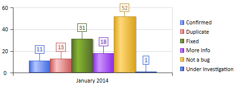
Figure 3: A Chart of Tagged Values

Partagez cette page Partagez par email Partagez sur LinkedIn Partagez sur X Partagez sur facebook